Final Project

I chose to do my movie on the idea of Self-love because I think it is a very important lesson girls should learn, especially in the world we live in today. Self-love was something I struggled with a lot and I wanted to make a story talking about how the media is the reason why this is something that is so hard to learn.

I chose these specific pictures because I felt they showed why girls hate their bodies, what the media does to women, and why women should love themselves. Each of these pictures go perfectly with the message I was trying to get out to viewers. It was easier to get the message out by using pictures with quotes on them because it clearly showed the point of the picture and its purpose.

I chose this music because I wanted a soft and slow tone that made the message powerful, but did not over take the movie. Also, I wanted it to be easy to understand and hear me clearly without the music being distracted.

I really enjoyed making this movie because the main point of the story is something that is very important to me and I am glad I got to get it out to the public. Even though I know people are most likely not going to see this, I wanted to make a personal video that could help girls and make them love themselves. This is something that is very difficult to overcome so I wanted to show girls what is wrong with the media and society, and why you should love yourself.

The only part that I had trouble with was learning how to use Garage Band. After I finally knew how to work it, I was happy with the outcome because I felt that the music made my video come alive and truly enhanced it.

30 Second Commercial

I chose to do the project on Together We Rise because it is a non-profit organization, which was what we needed, and I truly think it is a great organization to become a part of. I found out about this organization from my friend Jon because he is interning with Together We Rise over the summer and trying to get people to become aware of what children go through when they are sent through foster care.

I chose these pictures because I thought they best represented Together We Rise and what this organization is all about. It shows children in need of donations so they can have real bags to travel with, and it shows people working hard to create better lives for these children. I also chose pictures that had their teddy bear logo to get the logo recognized and get the organization more familiarized with so hopefully it will get more donations.

In my script, I tried to get the most important information out to the public. It was challenging picking enough information to fit in the 30 second time limit because I had so much to say, but I realized what the most important aspects were of the organization and what was going to be the most useful to those who were interested in donating.

This was my first time using iMovie so it was definitely a challenge for me to understand how to use it and get used to it. Thankfully this program was easy to use so I adjusted quickly. My biggest problem was timing the slides to make sure it was exactly 30 seconds, and to get everything I wanted to say out in that time limit. It was also hard to get the pictures to match with what I was saying but after playing around with the program, I figured out how to.

Music Kiosk

I chose American Typewriter and Zapfino as my two fonts because I thought they both correlated well with John Mayer and the type of person he is because they are both powerful in their own way and are clear for people to read. I chose the song “Age of Worry” because it shows me that I should not stress and I should just live my life.

I chose these pictures to show off John Mayer because I thought they all perfectly showed his image, type of fashion, parts of who he is, what his concerts look like, and also because they matched my concert poster project. The black and white photos, I thought, showed off his personality as serious and meaningful, along with his genre of blues.

The biggest problem I had with this project was learning how to put music into my presentation and making it play the whole time I was presenting. I had never done this before on PowerPoint so it was a big problem for me. I searched on Google how to perform this and I found a website that gave me step-by-step directions of what to do and how to do it. This was extremely helpful and helped me to overcome this issue.

My favorite part of this project was researching facts and information about John Mayer because I learned so many new things about him. I learned the meanings of all of his tattoos, the meanings behind most of his songs and why he perused a career in music.

I am most proud of the collage at the end because it shows different sides of John Mayer, on and off the stage. And it also gives visual to the viewers what his type of style is and his self image.

If I had more time with this project, I would have played around more with PowerPoint and made the presentation a little more creative with backgrounds and maybe even put in two songs!

Concert Poster

Concert Poster Design Rational

Concert Poster Design Rational

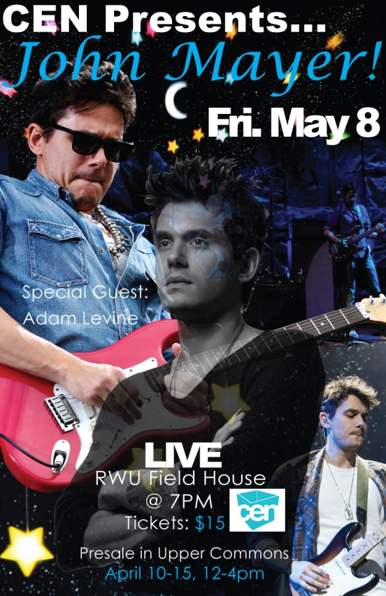
I chose to do my project on John Mayer because he is my favorite singer and I love his type of music. He is just such a relaxing person to listen to and I just love his voice.

I chose to use the fonts Zapfino and Arial Black because Zapfino is a cursive font and arial black is simple, which I thought it went very well with my poster and it even connects perfectly to the type of person John Mayer is and his music genre. I think it connects so well to those two things because it is like a laid back, relaxing, but powerful font style, which is just like the type of artist John Mayer, is.

I wanted John Mayer’s name to be at the top because it is an important aspect of the poster and who was presenting the concert. I put the concert information at the bottom because I felt that if people were really interested in attending, they would spend more time looking at it to see it at the bottom, and also not really care that that information was not the first thing they saw.

My biggest problem was choosing what pictures to use of John Mayer that would perfectly portray the kind of artist he is. I overcame this problem by just searching and finding pictures that showed him playing his famous guitar and what his concerts look like, to give the public a little sneak peek of what they are going to see.

I am most proud of the way I combined both color and black and white pictures because I think it makes the poster unique and original.

If I had more time I would have played around with more pictures and see what else I could have added to make it even better. Also, maybe search for more fonts.

Animated Postcard

Animated Postcard Design Rationale

Animated Postcard Design Rationale

Surprisingly, I did not encounter many problems during this project, but the only one that I did was I had trouble putting the e-collage at the end of the gif and how to get it so it did not pop up on every frame. After playing around for awhile, I realized I had to make a new frame at the end and turn off all the layers that had the words on them so the frame was completely white. Then, I had to drag the e-collage photo onto the screen and this way it only came up on one frame instead of all of them. Another problem I had encountered was trying to figure out how long to make each frame so it all flowed together nicely and did not look choppy. I played around with all the times and realized that for each word .4 seconds worked the best and as the photo flowed in, I made each of those frames .1 seconds because it looked less choppy and more swiftly.

I am most proud of the whole project because I think I did a great job and I love it! I am proud of this project because everything goes together perfectly and it flows very nicely. The quote looks so good with the e-collage I created and they both match each other very well. The frames all have perfect times because they do not take too long to run through, but they are long enough for people to be able to read the quote and see the image fully before it reruns.

If I had more time, I would have played around a little more with the timing of each frame to maybe see what best fit each word and maybe even have it flow even better. I also would have played with the gradient and change it to make the picture come in more quickly and maybe even brighter.

E-Collage Project

E-CollageeeeeI chose the sunset picture, the picture of the palm trees, and the sunflowers because I felt that these pictures all represented my font poem very well. My font poem is “It’s not what you look at that matters, it’s what you see.” When I heard this quote, the first thing I thought of were the world’s most beautiful things such as sunsets, sunrises, geography and nature. All of these pictures are pure beauty and have more meaning than just being pretty; they show that this world has a lot to offer if you look deeper than just the physical appearance.

I wanted the sunset to be the background of all of the three layers because I felt that it would look the best and was a great basis for the other pictures to lie on top of. Also, I made that layer have 100% opacity because I felt that it was the most powerful picture I had and I wanted it to really stand out. The next layer I had was the palm trees and I put them at 44% opacity. I wanted them to also stand out because they mean a great deal to me, but as I played around with the opacity levels, I realized that they looked much better faded. Also, it blended so greatly with the background and I did not want to lose that. Lastly, I put the sunflowers on the top layer because I wanted them to be more by themselves and separated from the palm trees because I thought it would make a more powerful statement. At first I only had one sunflower and I was going to also make this picture have 100% opacity, but I did not want eyes to go to that first and I did not want to make it the focal point of the whole picture. I started to make it blend and realized it was looking so much better. By blending the flower, it gave every part of my project it’s own way to shine. The sunflower looked very out of place on its own so I added another one and placed them in separate spots from each other. The second sunflower helped make the e-collage look so much better and I loved the way it looked blended in with the trees.

I encountered a few problems when I started this project because I had never blended pictures before. One problem that I first made was I accidentally erased the picture on the actual photo instead of the clipping mask. After making this mistake once, I made sure I never did it again because I had to restart all over. Another problem that I encountered was that I was not even sure how to blend pictures! I had to press a few buttons before I realized that it was the opacity I had to move to lower percentage to get the pictures to blend. This problem only lasted a few minutes but it was a big deal because that was the whole point of the project.

I am most proud of the way I erased the background of the sunflower and erased around the petals. This may not seem like a big deal but it was a lot harder than it looks. I had to go around each petal and if I erased part of the flower, I had to go back and fix it. It was time consuming and frustrating, but I think I did a good job and I love the way it looks.

If I had more time, I would’ve definitely added more pictures and played around with the blending more to try new things and get more practice. Also, I would have taken the time to take the pen tool around the palm trees and make them perfect. Except, I would need a lot more time for that!

Font Poem Project

Font Poem

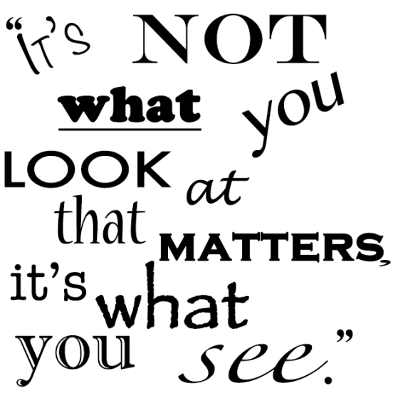
For my font poem project, I chose a quote from Henry David Thoreau that has a lot of meaning to myself personally, and the way I live my life. The quote is, “It’s not what you look at that matters, it’s what you see.” To me, this quote means that everything has meaning if you look deep enough, and what you see says a lot about the kind of person you are. I try to follow this and look deeply into everything because there is more to life than what meets the eye.

I chose these fonts because each served a different purpose. I think that the words not, what, look, matters, and see are the most important words from this quote so I made them stand out more than the other words by choosing thicker fonts or fonts that are in all caps. The different fonts I used for my project are noteworthy, engraves MT, copper std, bangla MN, future, Lucida Handwriting, nueva std, copperplate gothic bold, American typewriter, papyrus, imprint MT shadow, and zapfino.

I arranged the words this way because I wanted it to look crafty and not simple. I thought it would give it a more fun look if some words were on an angle and if they were not all aligned in a straight line that we always see in textbooks and novels. It gives the quote a more interesting way to look at it and maybe even a little more meaning.

I only faced one problem during this project and it was to use layers for each word. At first I did not realize each word had to be on it’s own layer in order to edit it on its own but once I realized my mistake, I just deleted the words and started over. I made new text boxes for each individual word, which put them on separate layers.

I am most proud of the design I made and the way I arranged the words because it makes it look more art oriented and adds a cool design to it.

If I had more time I would have maybe added color to the words I wanted to stick out to make an even bolder statement. Also, I would have maybe looked up more fonts and download them to make the project even better.

Contact Sheet

Screen Shot 2014-09-09 at 11.26.38 AM

The pictures I chose for my contact sheet project reflected on myself, which is the primarily reason for choosing those six specific pictures. I chose a sunset picture from a boat because I think sunsets a breathtakingly beautiful and relaxing, and also because my summer consisted of my boyfriend and I going on his boat. I chose a picture of Roger Williams during the fall because I think this school is beautiful, especially on the shell path down by the water, and also, because fall is my favorite season. The trees’ leaves just looked so perfect and the colors went together perfectly. I chose the yellow flowers picture because yellow is my favorite color and flowers make me happy. I chose the picture of the moon rising on the water because I think the moon is so cool and interesting. I chose the aquarium picture of the fish because the colors were so vibrant and pretty and also, because I had a great day at the aquarium when I took that picture. Lastly, I chose the picture of the palm trees because I went to California this past summer and it was the best vacation I have ever been on. Also, because I think palm trees are awesome.

I chose the pictures the order that I did because I thought they would look cool and interesting with the effects we had to do.

I encountered many problems during this project but they were all easy to solve. The CYMK picture kept popping up as a black box when I transferred it over to the Word Document, eventually after I kept pasting it on Word so many times, it eventually showed up correctly. Another problem I encountered was trying to fit all of the pictures on one page. I had to resize my pictures and make sure they were all 1 inch by 1 inch and move them around a little bit. After all the stress and irritation, it all eventually fit on one page, thankfully.

I am most proud of the row that had to be changed into different colors, such as greyscale and DuoTone because I learned how to change it on my own and I was very proud of myself for not needing help on how to do that.

If I had more time on this project, I would have learned how to make all the pictures aligned and centered so the descriptions in all of the pictures were at the bottom. Also, I would have played around with photoshop a little more to see what else there is to do but I have all semester for that! 🙂